Page 1 of 14
Australian GEOcoin images
Posted: 23 December 05 5:48 pm
by ADAcache
There has been a concern raised that the current logo on the GEOcoin I have designed may cause confusioin between the GCA.COM.AU and the GC.COM sites. <BR><BR>
The current design is<br><BR>
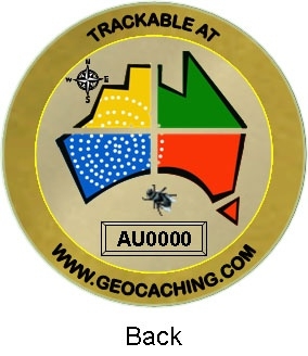
<BR><BR>which may cause some confusion because the logo is very close to the one used on the GCA site, but the advertised link is to GC.COM<br><Br>
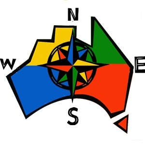
here is the new logo I worked out<br><br>
<br><br>and how it looks on the coin<br><br>
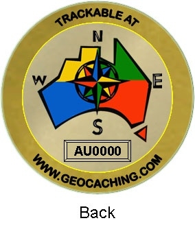
<BR><BR>Let me know what you think, all comments are welcome<BR><BR>
ADAcache
Posted: 23 December 05 5:50 pm
by Cached
I like it!
Posted: 23 December 05 6:49 pm
by GIN51E
i like the first one as in original
Posted: 23 December 05 10:44 pm
by alpha993
I must admit, I prefer the original design
Posted: 24 December 05 12:16 am
by muzza
I also prefer the original if I had the choice.
Posted: 24 December 05 12:24 am
by !mike
I also prefer the original.
Gee wiz, how can anyone mistake the symbol for anything other than an image of Oz?
Perhaps some people would prefer a map of texas...
Edit: Oh, and what happened to the blowie? Got ta have a blowie mate.
Posted: 24 December 05 12:59 am
by c.j.b
Just one thing to ask about -- why does it have a compass, for a sport that doesn't really use them? :-)
Posted: 24 December 05 8:39 am
by desdal
I like the original design, but please get rid of the fly. What does it say about geocaching or Australia?
Posted: 24 December 05 9:36 am
by Udderchaos
i agree
The flys are in plague proportions the year.
I like the first coin sans fly
Posted: 24 December 05 9:45 am
by Team Piggy
Personally I wonder about using the GCA logo on a geo.com coin? but thats my opinion

Posted: 24 December 05 10:08 am
by ideology
we prefer the second version because we think it is confusing to use the gca logo with the url "geocaching.com"
having said that, we didn't design the logo, so it's up to woodiebro and tlc what they want to do!
Posted: 24 December 05 10:40 am
by Fairly Magic
I like the new version. And we use a compass when caching.
Cheers Quilter
Posted: 24 December 05 11:59 am
by acts2youthgroup
Now to throw a cat in, Thats only one side what are you going to put on the other side.
Posted: 24 December 05 12:36 pm
by TEAM LANDCRUISER
ideology wrote:we prefer the second version because we think it is confusing to use the gca logo with the url "geocaching.com"
having said that, we didn't design the logo, so it's up to woodiebro and tlc what they want to do!
<p> <br>As per George² request ...<p>
For our part in the discussion any graphics we work on for geocaching are for everyone ... ie. no copyrights / royalties.<br>As this logo was designed for Geocaching Australia I really think it should be the logo on the swaggies or coins (in the future) that are trackable on the Aussie website IMHO.<p>
As for the new coin design ... I think it works well<br>We also use a compass when caching ... one day you'll be stuck out in the 'never never' and your batteries will fail, or your GPS will be dropped and you'll wish you had a compass and a map then
<p>
EDIT: <br>
P.S. the other side of the coin has already been designed it's in another thread ... we should have one thread for all these coin discussions

Posted: 24 December 05 4:16 pm
by Chwiliwr
Team Piggy wrote:Personally I wonder about using the GCA logo on a geo.com coin? but thats my opinion
This is an Australian geocoin trackable only at GC so how does it make it a GC coin and in my opinion having the GCA logo is preferable to the others suggested in this topic.
TLC
If you prefer this logo to only be used for GCA then there are restrictions on its use and you have passed the copyrights to GCA by default. You are in effect only allowing the logo to be used on the GCA site or for a GCA authorised product.